第三回 「文字とクラブ」
Graphic Design
ARKUDA LABEL
2025
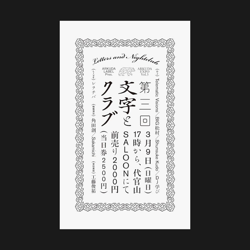
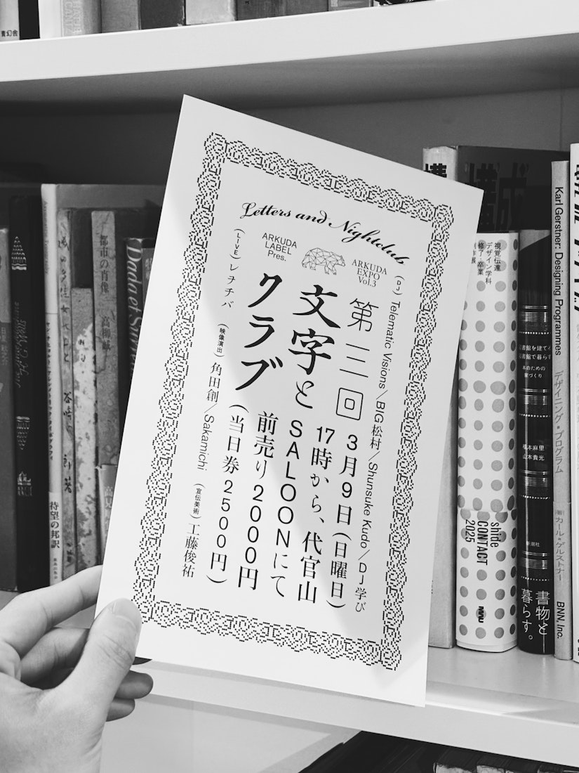
クラブイベントに「文字」という制約を設けた際に、どのような体験が生まれるのか。文字と電子音楽が交わった先を探る実験的イベント「文字とクラブ」のフライヤー。この一枚に使用された書体数は飾り罫あわせて10。日本語の混植と濃淡の激しいコントラストにおけるリズムを探る一枚。ビートを並べる、文字を並べる……ミニマルな繰り返しの中に、グルーヴを見つける。文字とテクノとの結節点はそこに存在するのではないかと考える。
What kind of experience emerges when a club event is framed with the constraint of “letters”? This flyer is for an experimental event called Moji to Club (“Letters and Nightclub”), which explores the intersection between typography and electronic music. A total of ten typefaces, including decorative borders, were used in this single piece. It’s an exploration of rhythm within the intense contrast and interplay of mixed Japanese typefaces. Lining up beats, lining up letters... finding groove within minimalist repetition. Perhaps the intersection of typography and techno lies precisely there.
Client
ARKUDA LABEL
Year
2025
Size
A4
Typefaces
Bickham Script , JJannon,
Akzidenz Grotesk,
和田研細丸ゴシック, 弘道軒清朝復刻版,
築地体前期五号仮名,
石井ゴシック, Ro本明朝,
築地体三号細仮名,
Founders Caslon Ornaments
(ビットマップ解釈版)Graphic design
Shunsuke Kudo
Venue
SALOON, Daikanyama
Event date
March 9th, 2025